THE EQUINOX
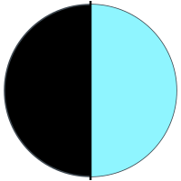
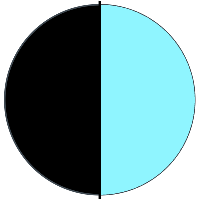
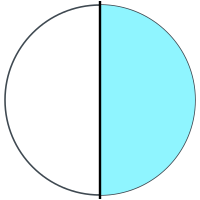
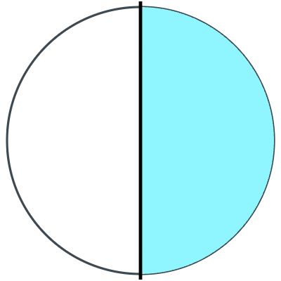
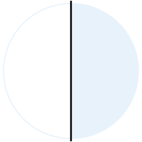
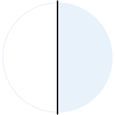
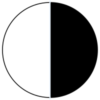
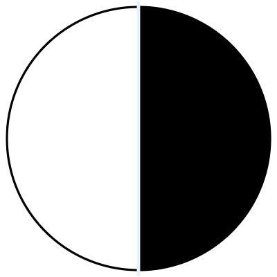
Half light, half dark, split down the middle — the equinox. One glyph that reads the same at 24px and on a wall.
LOGOS
Four shapes, five colorways. Pick by background: cyan on dark, cyan-on-light on paper, mono for one-ink print.
PALETTE
Black is the canvas. Cyan is the voice. Click a swatch to copy it.
linear-gradient(135deg, #8FF5FF 0%, #9492FF 100%)linear-gradient(180deg, #000000 0%, #060F16 100%)TYPOGRAPHY
Three faces, three jobs. All free on Google Fonts.
Space Grotesk
300 — 700
Headlines · wordmark · labels · buttons
INNOVATION WITHOUT FRONTIERS
Headlines: 700, uppercase, tracking −0.04em, line-height 0.9
Inter
300 — 700
Body copy
The first innovation laboratory of the Colombian Pacific.
Body: 300 (light), line-height 1.65
Space Mono
400, 700
Labels · numbers · code
CALI, COLOMBIA // 3.4516° N // 0123456789
Metadata: 400, 10px, uppercase, tracking +0.2em
ICONS & SOCIAL
Every favicon size, plus square avatars for social.


SOCIAL AVATARS
RULES
The mark works because it is used the same way every time.
- +Keep clear space of at least one bracket-height around the lockup
- +Use cyan-on-black or cyan-transparent on any dark surface
- +Use cyan-on-light on white, paper and documents
- +Keep the axis line vertical, always
- +Ambient cyan glow is allowed on dark surfaces
- −Never recolor outside the five approved colorways
- −Never distort, rotate, stretch or outline the mark
- −Never add drop shadows, bevels or gradients to the logo
- −Never place the mark below 24px, or the lockup below 120px wide
- −Never rebuild the wordmark in another typeface
USING THE BRAND?
Press and partners: use these as they are. Need something custom? Ask us.